> ## Documentation Index
> Fetch the complete documentation index at: https://docs.lightdash.com/llms.txt
> Use this file to discover all available pages before exploring further.

# Embedding with React SDK

> Components, props, and hooks for embedding Lightdash content in a React or Next.js app

<Tip>
  **Try it and see the code.** [embed.lightdash.com](https://embed.lightdash.com) is an interactive demo and helper that lets you preview embedded content and generate a JWT for your own project. For a working end-to-end example, see the [example embed app on GitHub](https://github.com/lightdash/example-embed-dashboard-with-nodejs-app) — a Node.js app that mints tokens server-side and renders a Lightdash dashboard.
</Tip>

## Overview

The Lightdash React SDK (`@lightdash/sdk`) provides React components for embedding Lightdash content in your React or Next.js applications. The SDK offers advantages over [iframe embedding](/embed/iframe):

* Seamless integration with your React application
* Programmatic filters for dashboards
* Callbacks for user interactions (e.g., explore navigation)
* Custom styling to match your application
* TypeScript support with full type definitions

For iframe embedding, see the [embedding reference](/embed/reference).

## Set up CORS

To use the React SDK, you need to update your "Cross-Origin Resource Sharing" (CORS) policy so the domain hosting your React app is allowed to call the Lightdash API.

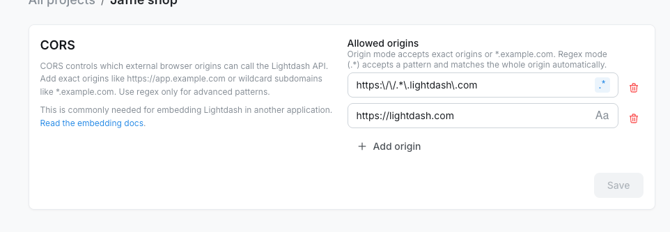
In Lightdash, go to **Project settings -> Embed configuration -> CORS** and add each origin where you'll use the SDK.

<Frame>
  <img src="https://mintcdn.com/lightdash/r5g66-wQ4pdXMZMF/images/embed/react-sdk/embed-cors-settings.png?fit=max&auto=format&n=r5g66-wQ4pdXMZMF&q=85&s=3e2d3ddcbecf705593dd4b9a31d9ab47" alt="CORS settings panel showing regex and exact origin entries" width="962" height="333" data-path="images/embed/react-sdk/embed-cors-settings.png" />
</Frame>

Use **origin mode** for exact origins and simple subdomain wildcards:

* `https://app.example.com` allows only that exact origin.
* `*.example.com` allows HTTPS subdomains like `https://app.example.com` and is saved as a regex pattern.

Use **regex mode** (`.*`) for advanced patterns. Enter the pattern body only; Lightdash matches the whole origin automatically. For example, `https:\\/\\/.*\\.example\\.com` allows subdomains of `example.com`.

<Warning>
  Only add origins you control. Avoid broad patterns that could match arbitrary external domains.
</Warning>

For self-hosted deployments, you can also configure instance-level allowed origins with environment variables:

```bash theme={null}
LIGHTDASH_CORS_ALLOWED_DOMAINS=https://domain-where-you-are-going-to-use-the-sdk.com
```

CORS is enabled by default. Set `LIGHTDASH_CORS_ENABLED=false` only if you want to disable CORS for the whole instance.

Browsers enforce a Same-Origin Policy that blocks a web application from making requests to a domain other than the one that served it. Because the React SDK calls the Lightdash API from your frontend, your instance has to name your application's origin in its CORS configuration for those requests to go through.

<Warning>
  CORS is **only required for the React SDK**. iframe embedding does not require CORS configuration.
</Warning>

## Installing the Lightdash SDK

In your frontend project, use your preferred package manager to install the SDK.

```bash theme={null}
npm install @lightdash/sdk
# or
pnpm add @lightdash/sdk
# or
yarn add @lightdash/sdk
```

<Info>
  At the moment, we support React 18 and 19, so make sure your frontend is using React 18 or later.
  For Next.js, version 15 or later is required.
</Info>

### Import CSS styles

The Lightdash SDK requires CSS styles to render components correctly. Import the SDK's CSS file as the **first import** in your React application's entry point:

```tsx theme={null}
import "@lightdash/sdk/sdk.css";

import React from "react";
import ReactDOM from "react-dom/client";
import App from "./App";

ReactDOM.createRoot(document.getElementById("root")!).render(
  <React.StrictMode>
    <App />
  </React.StrictMode>
);
```

<Warning>
  The CSS import must be the first import in your entry file to ensure Lightdash styles load before other styles and avoid conflicts.
</Warning>

## Components and hooks

The Lightdash SDK exports components for embedding Lightdash content and hooks for building custom host-app UI around embedded content:

* `Lightdash.Dashboard` - Embed complete dashboards with multiple tiles
* `Lightdash.DashboardBuilder` - Let embedded users create a brand-new dashboard
* `Lightdash.Chart` - Embed individual saved charts
* `Lightdash.Explore` - Embed interactive data exploration interface
* `Lightdash.AiAgent` - Embed an AI agent so users can chat with their data
* `Lightdash.MetricsCatalog` - Embed the project metrics catalog so users can browse and explore metrics
* `Lightdash.useLightdashContent` - List spaces, dashboards, charts, and data apps for a custom content catalog
* `Lightdash.useLightdashAiAgentThreads` - List an embed user's previous AI agent threads to build a thread history UI

All components share common props for authentication and styling.

### Lightdash.Dashboard

Embed complete Lightdash dashboards with multiple visualizations, filters, and interactive features. See [Embedding dashboards](/embed/embed-dashboards) for the JWT claims that control what viewers can do.

#### Props

```typescript theme={null}
type DashboardProps = {
  // Required
  instanceUrl: string;              // Your Lightdash instance URL
  token: string | Promise<string>;  // JWT (can be async)

  // Optional
  theme?: 'light' | 'dark';         // Force light or dark color scheme
  styles?: {
    backgroundColor?: string;       // Background color or 'transparent'
    fontFamily?: string;            // Font family for all text
  };
  filters?: SdkFilter[];            // Apply filters programmatically
  paletteUuid?: string;             // Color palette UUID for custom theming
  contentOverrides?: LanguageMap;   // Translate your content (names, titles, markdown)
  uiOverrides?: SdkUiOverrides;     // Translate Lightdash UI strings (filters, menus, buttons)
  isEditMode?: boolean;             // Render the dashboard in edit mode (requires writeActions JWT)
  onEditModeChange?: (
    isEditMode: boolean,
  ) => void;                        // Callback when the embed enters or leaves edit mode
  onExplore?: (options: {
    chart: SavedChart
  }) => void;                       // Callback when user navigates to explore
};
```

#### Basic usage

```tsx theme={null}
import Lightdash from '@lightdash/sdk';

function MyDashboard() {
  return (
    <Lightdash.Dashboard
      instanceUrl="https://app.lightdash.cloud"
      token={generateToken()} // Server-side function
    />
  );
}
```

#### With filters

Apply filters programmatically using the `filters` prop:

```tsx theme={null}
import Lightdash, { FilterOperator } from '@lightdash/sdk';

<Lightdash.Dashboard
  instanceUrl="https://app.lightdash.cloud"
  token={token}
  filters={[
    {
      model: 'orders',
      field: 'status',
      operator: FilterOperator.EQUALS,
      value: 'completed',
    },
    {
      model: 'orders',
      field: 'created_date',
      operator: FilterOperator.IN_BETWEEN,
      value: ['2024-01-01', '2024-12-31'],
    },
  ]}
/>
```

See [Filtering data](#filtering-data) for complete filter documentation.

#### With styling

```tsx theme={null}
<Lightdash.Dashboard
  instanceUrl="https://app.lightdash.cloud"
  token={token}
  styles={{
    backgroundColor: '#f5f5f5',
    fontFamily: 'Inter, sans-serif',
  }}
/>
```

#### With explore callback

Track when users navigate to explore:

```tsx theme={null}
<Lightdash.Dashboard
  instanceUrl="https://app.lightdash.cloud"
  token={generateToken({ canExplore: true })}
  onExplore={({ chart }) => {
    console.log('User exploring chart:', chart.name);
    // Track analytics, show help guides, etc.
  }}
/>
```

#### With edit mode

When the JWT includes a `writeActions` claim, you can render an existing dashboard in edit mode and let users rename it, add saved charts from the allowed space, move or resize tiles, and save changes. The host app controls the edit-mode state through `isEditMode` and `onEditModeChange`.

```tsx theme={null}
import Lightdash from '@lightdash/sdk';
import { useState } from 'react';

function EditableDashboard() {
  const [isEditMode, setIsEditMode] = useState(false);

  return (
    <>
      {!isEditMode && (
        <button onClick={() => setIsEditMode(true)}>Edit dashboard</button>
      )}
      <Lightdash.Dashboard
        instanceUrl="https://app.lightdash.cloud"
        token={generateToken()} // JWT must include writeActions
        isEditMode={isEditMode}
        onEditModeChange={setIsEditMode}
      />
    </>
  );
}
```

Add-tile content is filtered to the JWT `writeActions.spaceUuid`, so users can only pick saved charts from the allowed space. See [Write actions](/embed/reference#write-actions) for the JWT claim.

### Lightdash.DashboardBuilder

Let embedded users build a brand-new dashboard from scratch. On mount, the SDK creates an empty dashboard in the JWT `writeActions.spaceUuid` and renders it through the same embedded dashboard component as `Lightdash.Dashboard`. The host app controls when the dashboard is in edit mode.

Use this when you want your customers to author their own dashboards inside your app — for example, a "Create dashboard" page in your customer portal — without giving them a Lightdash login.

#### Props

```typescript theme={null}
type DashboardBuilderProps = {
  // Required
  instanceUrl: string;              // Your Lightdash instance URL
  token: string | Promise<string>;  // JWT with writeActions claim

  // Optional
  theme?: 'light' | 'dark';
  styles?: {
    backgroundColor?: string;
    fontFamily?: string;
  };
  filters?: SdkFilter[];
  paletteUuid?: string;
  contentOverrides?: LanguageMap;
  uiOverrides?: SdkUiOverrides;
  isEditMode?: boolean;             // Render the new dashboard in edit mode
  onEditModeChange?: (
    isEditMode: boolean,
  ) => void;                        // Callback when the embed enters or leaves edit mode
  onDashboardReady?: (
    dashboard: EmbedDashboard,
  ) => void;                        // Called once the empty dashboard has been created
  onExplore?: (options: {
    chart: SavedChart
  }) => void;
};
```

#### Basic usage

```tsx theme={null}
import Lightdash from '@lightdash/sdk';
import { useEffect, useState } from 'react';

function MyDashboardBuilder() {
  const [isEditMode, setIsEditMode] = useState(false);
  const [isReady, setIsReady] = useState(false);

  return (
    <>
      {isReady && !isEditMode && (
        <button onClick={() => setIsEditMode(true)}>Edit dashboard</button>
      )}
      <Lightdash.DashboardBuilder
        instanceUrl="https://app.lightdash.cloud"
        token={generateToken()} // JWT must include writeActions
        isEditMode={isEditMode}
        onEditModeChange={setIsEditMode}
        onDashboardReady={() => setIsReady(true)}
      />
    </>
  );
}
```

#### Requirements and behavior

* The JWT must include a `writeActions` claim with `spaceUuid`. JWTs without `writeActions` fail closed for write-capable paths.
* The new dashboard is created in `writeActions.spaceUuid`, named "Untitled dashboard", and is empty.
* Add-tile content (saved charts and SQL charts) is filtered to the same space.
* Dashboards created or edited through the SDK are normal Lightdash dashboards — they can be viewed and edited from Lightdash and vice versa.
* See [Write actions](/embed/reference#write-actions) for the JWT claim and how to configure the actor and destination space.

### Lightdash.Chart

Embed individual saved charts for focused, single-metric displays with minimal UI.

#### Props

```typescript theme={null}
type ChartProps = {
  // Required
  instanceUrl: string;              // Your Lightdash instance URL
  id: string;                       // Chart UUID (savedQueryUuid)
  token: string | Promise<string>;  // JWT with type: 'chart'

  // Optional
  theme?: 'light' | 'dark';         // Force light or dark color scheme
  styles?: {
    backgroundColor?: string;       // Background color or 'transparent'
    fontFamily?: string;            // Font family for all text
  };
  contentOverrides?: LanguageMap;   // Translate your content (names, titles, markdown)
  uiOverrides?: SdkUiOverrides;     // Translate Lightdash UI strings (filters, menus, buttons)
};
```

<Info>
  Unlike Dashboard, Chart does not support `filters` or `onExplore` props since charts are read-only and cannot navigate to explore.
</Info>

#### Basic usage

```tsx theme={null}
import Lightdash from '@lightdash/sdk';

function MyChart() {
  return (
    <Lightdash.Chart
      instanceUrl="https://app.lightdash.cloud"
      id="your-chart-uuid"
      token={generateChartToken()} // Server-side function
    />
  );
}
```

#### With styling

```tsx theme={null}
<Lightdash.Chart
  instanceUrl="https://app.lightdash.cloud"
  id="your-chart-uuid"
  token={token}
  styles={{
    backgroundColor: 'white',
    fontFamily: 'Helvetica, Arial, sans-serif',
  }}
/>
```

#### Token generation for charts

Charts require a JWT with `type: 'chart'`:

```javascript theme={null}
// Backend API endpoint
import jwt from 'jsonwebtoken';

export function generateChartToken(chartId) {
  return jwt.sign({
    content: {
      type: 'chart',
      contentId: chartId,  // savedQueryUuid
      canExportCsv: true,
      canExportImages: false,
      canViewUnderlyingData: true,
    },
  }, process.env.LIGHTDASH_EMBED_SECRET, { expiresIn: '24h' });
}
```

See [Embedding charts guide](/embed/embed-charts) for details.

### Lightdash.Explore

Embed interactive data exploration interface with full query builder capabilities.

#### Props

```typescript theme={null}
type ExploreProps = {
  // Required
  instanceUrl: string;              // Your Lightdash instance URL
  token: string | Promise<string>;  // JWT with canExplore: true

  // Optional
  theme?: 'light' | 'dark';         // Force light or dark color scheme
  styles?: {
    backgroundColor?: string;       // Background color or 'transparent'
    fontFamily?: string;            // Font family for all text
  };
  contentOverrides?: LanguageMap;   // Translate your content (names, titles, markdown)
  uiOverrides?: SdkUiOverrides;     // Translate Lightdash UI strings (filters, menus, buttons)
};
```

#### Basic usage

```tsx theme={null}
import Lightdash from '@lightdash/sdk';

function MyExplore() {
  return (
    <Lightdash.Explore
      instanceUrl="https://app.lightdash.cloud"
      token={generateExploreToken()} // Must include canExplore: true
    />
  );
}
```

#### With styling

```tsx theme={null}
<Lightdash.Explore
  instanceUrl="https://app.lightdash.cloud"
  token={token}
  styles={{
    backgroundColor: '#f9f9f9',
    fontFamily: 'Inter, sans-serif',
  }}
/>
```

#### Token generation for explores

Explores require `canExplore: true` in the JWT:

```javascript theme={null}
// Backend API endpoint
import jwt from 'jsonwebtoken';

export function generateExploreToken() {
  return jwt.sign({
    content: {
      type: 'dashboard',  // Can use dashboard type
      dashboardUuid: 'starting-dashboard-uuid',
      canExplore: true,   // Required for explore access
      canExportCsv: true,
      canExportImages: true,
    },
  }, process.env.LIGHTDASH_EMBED_SECRET, { expiresIn: '4h' });
}
```

### Lightdash.AiAgent

Embed a Lightdash [AI agent](/agents) so embedded users can chat with their data, generate charts, and save results back to a fixed space — without a Lightdash login.

The component renders the agent inside an iframe. Use `threadUuid` to deep-link into an existing thread, or omit it to land on the new-thread screen.

#### Props

```typescript theme={null}
type AiAgentProps = {
  // Required
  instanceUrl: string;              // Your Lightdash instance URL
  agentUuid: string;                // Agent to embed (must match the JWT)
  token: string | Promise<string>;  // JWT with content.type: 'aiAgent'

  // Optional
  threadUuid?: string;              // Open a specific thread on load
  onThreadChange?: (options: { threadUuid: string }) => void; // Fires when the embed opens or creates a thread
  theme?: 'light' | 'dark';
  styles?: {
    backgroundColor?: string;
  };
};
```

<Info>
  `Lightdash.AiAgent` does not accept `filters`, `contentOverrides`, `uiOverrides`, or `onExplore`. Threads, navigation, and chart actions are managed inside the embedded agent UI.
</Info>

`onThreadChange` fires whenever the embedded agent creates a new thread or opens an existing one. Use it together with `threadUuid` to persist the current conversation in your app (for example in `localStorage` or your own backend) and resume it the next time the user returns. Under the hood, the SDK passes a `targetOrigin` query parameter to the iframe and listens for `lightdash:aiAgentThreadChanged` `postMessage` events from the embedded page — no extra setup is required on your side.

#### Basic usage

```tsx theme={null}
import Lightdash from '@lightdash/sdk';

function MyAiAgent() {
  return (
    <Lightdash.AiAgent
      instanceUrl="https://app.lightdash.cloud"
      agentUuid="your-agent-uuid"
      token={generateAiAgentToken()} // Server-side function
    />
  );
}
```

#### Open a specific thread

Pass `threadUuid` to deep-link the embed into a specific conversation on mount:

```tsx theme={null}
<Lightdash.AiAgent
  instanceUrl="https://app.lightdash.cloud"
  agentUuid="your-agent-uuid"
  threadUuid="thread-uuid"
  token={token}
/>
```

#### Persist and resume the last conversation

Combine `threadUuid` and `onThreadChange` to keep users on their most recent thread across page reloads. This example stores the latest thread UUID in `localStorage`:

```tsx theme={null}
import Lightdash from '@lightdash/sdk';
import { useState } from 'react';

const STORAGE_KEY = 'acme-shop:lightdash-ai-thread';

function ShopInsightsAgent({ token }: { token: string }) {
  const [threadUuid, setThreadUuid] = useState<string | undefined>(
    () => localStorage.getItem(STORAGE_KEY) ?? undefined,
  );

  return (
    <Lightdash.AiAgent
      instanceUrl="https://app.lightdash.cloud"
      agentUuid="agent-shop-insights"
      token={token}
      threadUuid={threadUuid}
      onThreadChange={({ threadUuid: nextThreadUuid }) => {
        setThreadUuid(nextThreadUuid);
        localStorage.setItem(STORAGE_KEY, nextThreadUuid);
      }}
    />
  );
}
```

#### Token generation for AI agents

AI agent embeds require a JWT with `content.type: 'aiAgent'` and a `writeActions` claim that pins the destination space and the actor used for agent queries and chart saves:

```javascript theme={null}
// Backend API endpoint
import jwt from 'jsonwebtoken';

export function generateAiAgentToken() {
  return jwt.sign({
    content: {
      type: 'aiAgent',
      projectUuid: 'your-project-uuid',
      agentUuid: 'your-agent-uuid',
    },
    writeActions: {
      serviceAccountUserUuid: 'service-account-user-uuid',
      spaceUuid: 'destination-space-uuid',
    },
    userAttributes: {
      tenant_id: 'tenant-abc',
    },
  }, process.env.LIGHTDASH_EMBED_SECRET, { expiresIn: '1h' });
}
```

See [Embedding AI agents](/embed/embed-ai-agents) for the full guide and [AI agent token](/embed/reference#ai-agent-token) for the complete JWT structure.

### Lightdash.MetricsCatalog

Embed the Lightdash [metrics catalog](/semantic-layer/metrics) so embedded users can browse the metrics defined in a project, preview them, and — when the JWT allows it — continue into Explore without leaving your app.

The component renders the catalog inside an iframe. When a viewer clicks **Explore from here** on a metric, the SDK swaps in an embedded Explore view; a **Back** action returns them to the catalog.

#### Props

```typescript theme={null}
type MetricsCatalogProps = {
  // Required
  instanceUrl: string;              // Your Lightdash instance URL
  token: string | Promise<string>;  // JWT with content.type: 'metricsCatalog'

  // Optional
  theme?: 'light' | 'dark';         // Force light or dark color scheme
  styles?: {
    backgroundColor?: string;       // Background color or 'transparent'
    fontFamily?: string;            // Font family for all text
  };
};
```

<Info>
  `Lightdash.MetricsCatalog` does not accept `filters`, `contentOverrides`, `uiOverrides`, or `onExplore`. The catalog and the embedded Explore it launches are managed inside the component.
</Info>

#### Basic usage

```tsx theme={null}
import Lightdash from '@lightdash/sdk';

function MyMetricsCatalog() {
  return (
    <Lightdash.MetricsCatalog
      instanceUrl="https://app.lightdash.cloud"
      token={generateMetricsCatalogToken()} // Server-side function
    />
  );
}
```

#### Token generation for the metrics catalog

Metrics catalog embeds require a JWT with `content.type: 'metricsCatalog'` and a `projectUuid`. Set `content.canExplore` to `true` to let embedded users open Explore from a metric, and include a `writeActions` claim if you want them to save the resulting charts back to Lightdash.

```javascript theme={null}
// Backend API endpoint
import jwt from 'jsonwebtoken';

export function generateMetricsCatalogToken() {
  return jwt.sign({
    content: {
      type: 'metricsCatalog',
      projectUuid: 'your-project-uuid',
      canExplore: true,
    },
    writeActions: {
      serviceAccountUserUuid: 'service-account-user-uuid',
      spaceUuid: 'destination-space-uuid',
    },
    userAttributes: {
      tenant_id: 'tenant-abc',
    },
  }, process.env.LIGHTDASH_EMBED_SECRET, { expiresIn: '1h' });
}
```

Omit `canExplore` (or set it to `false`) to publish a read-only browse experience. See [Embedding the metrics catalog](/embed/embed-metrics-catalog) for the full guide and [Metrics catalog token](/embed/reference#metrics-catalog-token) for the complete JWT structure.

## API hooks

### Lightdash.useLightdashContent

Use `useLightdashContent` when you want your own app to list Lightdash content instead of embedding the Lightdash home page. A common pattern is to let customers choose a space in your UI, show the dashboards and charts in that space, then render the selected object with `Lightdash.Dashboard` or `Lightdash.Chart`.

The hook calls the Lightdash content API and returns metadata only. It does not render the selected chart or dashboard, and it does not replace the chart or dashboard embed token you pass to the render component.

#### Backend: generate an API access token

Generate the token on your backend with your Lightdash embed secret. Never expose the embed secret in browser code.

```typescript theme={null}
import jwt from 'jsonwebtoken';

export function generateContentCatalogToken() {
  return jwt.sign(
    {
      content: {
        type: 'apiAccess',
        projectUuid: 'your-project-uuid',
        serviceAccountUserUuid: 'service-account-user-uuid',
      },
      user: {
        externalId: 'customer-user-123',
        email: 'customer@example.com',
      },
      userAttributes: {
        tenant_id: 'tenant-abc',
      },
    },
    process.env.LIGHTDASH_EMBED_SECRET,
    { expiresIn: '1h' },
  );
}
```

The service account controls what the hook can list. If the service account cannot view a private space, content from that space is not returned.

#### Frontend: list content in a space

```tsx theme={null}
import Lightdash from '@lightdash/sdk';

function ContentCatalog({
  instanceUrl,
  projectUuid,
  token,
  spaceUuid,
}: {
  instanceUrl: string;
  projectUuid: string;
  token: string;
  spaceUuid: string;
}) {
  const { data, error, isLoading, refetch } = Lightdash.useLightdashContent(
    {
      instanceUrl,
      projectUuid,
      auth: {
        type: 'embedToken',
        token,
      },
    },
    {
      spaceUuids: [spaceUuid],
      contentTypes: ['dashboard', 'chart'],
      page: 1,
      pageSize: 50,
      sortBy: 'name',
      sortDirection: 'asc',
    },
  );

  if (isLoading) return <p>Loading content...</p>;
  if (error) return <p>Unable to load content</p>;

  return (
    <div>
      <button type="button" onClick={() => refetch()}>
        Refresh
      </button>

      {data?.data.map((item) => (
        <button key={item.uuid} type="button">
          {item.name}
        </button>
      ))}
    </div>
  );
}
```

#### Options

```typescript theme={null}
type ListContentOptions = {
  projectUuids?: string[];
  spaceUuids?: string[];
  parentSpaceUuid?: string;
  contentTypes?: Array<'space' | 'dashboard' | 'chart' | 'data_app'>;
  page?: number;
  pageSize?: number;
  search?: string;
  sortBy?: 'name' | 'space_name' | 'last_updated_at';
  sortDirection?: 'asc' | 'desc';
};
```

<Warning>
  Use the `spaceUuids` option as a filter, not as an authorization boundary — authorization comes from the API access token's service account permissions. `apiAccess` tokens are for API reads such as content listing; to let embedded users save charts or dashboards, use an embed token that supports `writeActions`.
</Warning>

### Lightdash.useLightdashAiAgentThreads

Use `useLightdashAiAgentThreads` when you want to show your users a list of their previous AI agent conversations — for example a "Recent chats" sidebar next to a `Lightdash.AiAgent` embed. The hook calls the AI agent threads endpoint with the embed JWT, so it returns only threads that belong to the JWT-authenticated embed user and are scoped to their embed space.

Pair it with `Lightdash.AiAgent`'s `threadUuid` and `onThreadChange` props to let users resume any past conversation.

#### Options

```typescript theme={null}
type ListAiAgentThreadsOptions = {
  agentUuid: string;      // The agent whose threads should be listed
  projectUuid?: string;   // Falls back to the projectUuid on LightdashApiClientConfig
};
```

The hook takes the same `LightdashApiClientConfig` as `useLightdashContent`, with `auth.type: 'embedToken'` and the AI agent embed JWT as the token.

#### Types

```typescript theme={null}
type LightdashAiAgentThreadResults = LightdashAiAgentThread[];

// One entry per thread the embed user can see. Full shape lives in
// @lightdash/common's ApiAiAgentThreadSummaryListResponse; the useful fields
// for building thread history UIs are:
type LightdashAiAgentThread = {
  uuid: string;
  title?: string;
  firstMessage: { message: string };
  // ...additional metadata such as timestamps
};
```

#### Example: thread history + resume

```tsx theme={null}
import Lightdash, {
  useLightdashAiAgentThreads,
  type LightdashApiClientConfig,
} from '@lightdash/sdk';
import { useState } from 'react';

const STORAGE_KEY = 'acme-shop:lightdash-ai-thread';

function ShopInsightsAgentWithHistory({
  token,
  projectUuid,
  agentUuid,
}: {
  token: string;
  projectUuid: string;
  agentUuid: string;
}) {
  const apiConfig: LightdashApiClientConfig = {
    instanceUrl: 'https://app.lightdash.cloud',
    projectUuid,
    auth: { type: 'embedToken', token },
  };

  const threads = Lightdash.useLightdashAiAgentThreads(apiConfig, {
    agentUuid,
    projectUuid,
  });

  const [threadUuid, setThreadUuid] = useState<string | undefined>(
    () => localStorage.getItem(STORAGE_KEY) ?? undefined,
  );

  return (
    <div style={{ display: 'grid', gridTemplateColumns: '280px 1fr' }}>
      <aside>
        <button type="button" onClick={() => setThreadUuid(undefined)}>
          New thread
        </button>

        {threads.isLoading && <p>Loading history…</p>}
        {threads.data?.map((thread) => (
          <button
            key={thread.uuid}
            type="button"
            onClick={() => setThreadUuid(thread.uuid)}
          >
            {thread.title ?? thread.firstMessage.message}
          </button>
        ))}
      </aside>

      <Lightdash.AiAgent
        instanceUrl="https://app.lightdash.cloud"
        token={token}
        agentUuid={agentUuid}
        threadUuid={threadUuid}
        onThreadChange={({ threadUuid: nextThreadUuid }) => {
          setThreadUuid(nextThreadUuid);
          localStorage.setItem(STORAGE_KEY, nextThreadUuid);
          // Refresh the sidebar so new threads show up immediately.
          threads.refetch();
        }}
      />
    </div>
  );
}
```

<Info>
  `useLightdashAiAgentThreads` uses the same embed JWT you pass to `Lightdash.AiAgent`. The token's `content.agentUuid` and `writeActions.spaceUuid` are what scope the returned threads — the hook cannot list threads from a different agent or space, even if you pass a different `agentUuid` argument.
</Info>

## Generating embed tokens

All SDK components require JWTs generated server-side, signed with the embed secret from [embed setup](/embed/set-up-embedding). Here's a complete example, including [user attributes](/workspace-admin/user-attributes) for row-level filtering:

### Backend API endpoint

```typescript theme={null}
// server/api/embed-token.ts
import jwt from 'jsonwebtoken';

export async function generateEmbedToken(req, res) {
  // Authenticate user
  const userId = req.user.id;
  const user = await getUserFromDatabase(userId);

  // Generate token with user-specific attributes
  const token = jwt.sign({
    content: {
      type: 'dashboard',
      dashboardUuid: 'your-dashboard-uuid',
      dashboardFiltersInteractivity: {
        enabled: 'all',
      },
      canExportCsv: true,
      canExplore: true,
    },
    userAttributes: {
      tenant_id: user.tenantId,  // Row-level filtering
    },
    user: {
      externalId: user.id,
      email: user.email,
    },
  }, process.env.LIGHTDASH_EMBED_SECRET, { expiresIn: '1h' });

  res.json({ token });
}
```

### Frontend React component

```tsx theme={null}
import Lightdash from '@lightdash/sdk';
import { useState, useEffect } from 'react';

function EmbeddedDashboard() {
  const [token, setToken] = useState<string | null>(null);

  useEffect(() => {
    // Fetch token from your backend
    fetch('/api/embed-token')
      .then(res => res.json())
      .then(data => setToken(data.token));
  }, []);

  if (!token) return <div>Loading...</div>;

  return (
    <Lightdash.Dashboard
      instanceUrl="https://app.lightdash.cloud"
      token={token}
    />
  );
}
```

<Warning>
  To ensure security, JWT generation code must run **in your backend**, and the **Lightdash embed secret** must never be exposed in frontend code. This prevents unauthorized access and protects sensitive data.
</Warning>

## Applying styles

Override styles within Lightdash components to match your application's design.

### Supported style overrides

```typescript theme={null}
styles?: {
  fontFamily?: string;       // Sets all fonts within the component
  backgroundColor?: string;  // Sets the background color or 'transparent'
}
```

Both properties accept normal CSS values and are set on a `styles` object passed to any component.

### Font family

Sets the font family for all text within the embedded content. Font sizes and other properties are preserved.

```typescript theme={null}
<Lightdash.Dashboard
  instanceUrl={lightdashUrl}
  token={lightdashToken}
  styles={{
    fontFamily: 'Inter, sans-serif',
  }}
/>
```

<Info>
  Some charts and components set `font-family` explicitly, so the `fontFamily` style is applied with higher specificity to override these.
</Info>

### Background color

Sets the background for the embedded content. Can be any color value or `'transparent'`.

```typescript theme={null}
<Lightdash.Dashboard
  instanceUrl={lightdashUrl}
  token={lightdashToken}
  styles={{
    backgroundColor: 'transparent',
  }}
/>
```

### Complete example

```typescript theme={null}
<Lightdash.Dashboard
  instanceUrl={lightdashUrl}
  token={lightdashToken}
  styles={{
    backgroundColor: '#f5f5f5',
    fontFamily: 'Helvetica, Arial, sans-serif',
  }}
/>
```

### CSS class overrides

Beyond the `styles` prop, you can target embedded dashboard elements directly from your application's stylesheet. Each element below carries a stable, human-readable classname that is part of the SDK's public API — it won't change when internal layout does, so your overrides stay resilient across releases.

| Class                             | Element                                                                                                                                                         |
| --------------------------------- | --------------------------------------------------------------------------------------------------------------------------------------------------------------- |
| `ld-dashboard-header`             | The dashboard header bar                                                                                                                                        |
| `ld-dashboard-filters`            | The filter bar row                                                                                                                                              |
| `ld-dashboard-filter`             | An individual filter pill                                                                                                                                       |
| `ld-dashboard-date-zoom`          | The date-zoom control(s)                                                                                                                                        |
| `ld-dashboard-parameters`         | The parameters row                                                                                                                                              |
| `ld-dashboard-parameter`          | An individual parameter pill                                                                                                                                    |
| `ld-dashboard-filter-dropdown`    | An open filter's dropdown                                                                                                                                       |
| `ld-dashboard-date-zoom-dropdown` | The open date-zoom menu                                                                                                                                         |
| `ld-dashboard-parameter-dropdown` | An open parameter's dropdown                                                                                                                                    |
| `ld-dashboard-guided-setup`       | The guided setup card shown while [required filters or requirement groups](/explore/dashboards/filter#required-filters-and-filter-requirement-groups) are unmet |

```css theme={null}
.ld-dashboard-filters {
  gap: 1rem;
}

.ld-dashboard-filter-dropdown {
  font-size: 1rem;
  min-width: 380px;
}
```

<Info>
  The filter, date-zoom, and parameter dropdowns render in a portal at the page root — outside the dashboard container — so target them with a global selector rather than as a descendant of the embedded dashboard.
</Info>

## Light and dark mode

Use the `theme` prop to render embedded content in either `'light'` or `'dark'` mode. This is typically driven by the host application's own theme state, so the embedded dashboard, chart, or explore matches the surrounding UI.

```tsx theme={null}
<Lightdash.Dashboard
  instanceUrl={lightdashUrl}
  token={lightdashToken}
  theme="dark"
/>
```

The `theme` prop is supported on `Lightdash.Dashboard`, `Lightdash.Chart`, and `Lightdash.Explore`.

<Info>
  When `theme` is set, the SDK forces the Mantine color scheme and ignores any user-toggled preference stored in the embed. Omit the prop to let the embed use its default (light) color scheme.
</Info>

### Syncing with your app's theme

Pass your app's current theme value directly to the SDK so the embed re-renders when it changes:

```tsx theme={null}
import Lightdash from '@lightdash/sdk';
import { useState } from 'react';

function EmbeddedDashboard() {
  const [theme, setTheme] = useState<'light' | 'dark'>('light');

  return (
    <Lightdash.Dashboard
      instanceUrl={lightdashUrl}
      token={lightdashToken}
      theme={theme}
    />
  );
}
```

### Combining with `styles.backgroundColor`

When `theme` is set, the embed uses the matching Mantine body background by default. If you also pass `styles.backgroundColor`, your value takes precedence:

```tsx theme={null}
<Lightdash.Dashboard
  instanceUrl={lightdashUrl}
  token={lightdashToken}
  theme="dark"
  styles={{
    backgroundColor: '#0b0b0f', // Overrides the default dark background
  }}
/>
```

## Color palettes

You can customize the appearance of embedded dashboards using color palettes. Define multiple color palettes in your organization settings, then apply them to embedded dashboards using the `paletteUuid` prop.

For more on customizing appearance, see [customizing the appearance of your project](/workspace-admin/appearance).

### Setting up color palettes

1. Go to **Organization settings > Appearance** in Lightdash
2. Define one or more color palettes
3. Copy the palette UUID for the palette you want to use (or fetch from API `GET /api/v1/org/color-palettes`)

### Applying a palette

Pass the `paletteUuid` prop to the `Lightdash.Dashboard` component:

```tsx theme={null}
<Lightdash.Dashboard
  instanceUrl="https://app.lightdash.cloud"
  token={token}
  paletteUuid="your-palette-uuid"
/>
```

## Filtering data

Filters can be passed to `<Lightdash.Dashboard/>` to filter dimensions by values. Filters are applied as AND operations, each further restricting results. The Chart and Explore components do not support the `filters` prop.

<Warning>
  For the `filters` prop to work, your JWT must have `dashboardFiltersInteractivity` set to `enabled: 'all'`. Without this configuration, filters will not be applied.
</Warning>

### Filter structure

```typescript theme={null}
type SdkFilter = {
  model: string;             // The model the dimension is part of
  field: string;             // The name of the dimension to filter by
  operator: FilterOperator;  // The filter operator (enum)
  value: unknown | unknown[]; // The value(s) to filter against
};
```

### Basic example

```javascript theme={null}
<Lightdash.Dashboard
  instanceUrl={lightdashUrl}
  token={lightdashToken}
  filters={[
    {
      model: 'dbt_users',
      field: 'browser',
      operator: FilterOperator.INCLUDE,
      value: ['chrome', 'safari'],
    },
  ]}
/>
```

### Multiple filters

Filters are applied as AND operations:

```javascript theme={null}
<Lightdash.Dashboard
  instanceUrl={lightdashUrl}
  token={lightdashToken}
  filters={[
    {
      model: 'dbt_users',
      field: 'created_date_week',
      operator: FilterOperator.IN_BETWEEN,
      value: ['2024-08', '2024-10'],
    },
    {
      model: 'dbt_users',
      field: 'browser',
      operator: FilterOperator.INCLUDE,
      value: ['chrome', 'safari'],
    },
    {
      model: 'orders',
      field: 'status',
      operator: FilterOperator.EQUALS,
      value: 'completed',
    },
  ]}
/>
```

### FilterOperator enum

Import `FilterOperator` from the SDK:

```typescript theme={null}
import Lightdash, { FilterOperator } from '@lightdash/sdk';
```

Available operators:

| Operator                               | Description                   | Value Type          |
| -------------------------------------- | ----------------------------- | ------------------- |
| `FilterOperator.IS_NULL`               | Field is null                 | n/a                 |
| `FilterOperator.NOT_NULL`              | Field is not null             | n/a                 |
| `FilterOperator.EQUALS`                | Field equals value            | single value        |
| `FilterOperator.NOT_EQUALS`            | Field does not equal value    | single value        |
| `FilterOperator.STARTS_WITH`           | Field starts with value       | single value        |
| `FilterOperator.ENDS_WITH`             | Field ends with value         | single value        |
| `FilterOperator.INCLUDE`               | Field includes any of values  | array               |
| `FilterOperator.NOT_INCLUDE`           | Field does not include values | array               |
| `FilterOperator.LESS_THAN`             | Field is less than value      | single value        |
| `FilterOperator.LESS_THAN_OR_EQUAL`    | Field is ≤ value              | single value        |
| `FilterOperator.GREATER_THAN`          | Field is greater than value   | single value        |
| `FilterOperator.GREATER_THAN_OR_EQUAL` | Field is ≥ value              | single value        |
| `FilterOperator.IN_THE_PAST`           | Date in the past N units      | single value        |
| `FilterOperator.NOT_IN_THE_PAST`       | Date not in past N units      | single value        |
| `FilterOperator.IN_THE_NEXT`           | Date in the next N units      | single value        |
| `FilterOperator.IN_THE_CURRENT`        | Date in current period        | single value        |
| `FilterOperator.NOT_IN_THE_CURRENT`    | Date not in current period    | single value        |
| `FilterOperator.IN_BETWEEN`            | Field between two values      | array with 2 values |
| `FilterOperator.NOT_IN_BETWEEN`        | Field not between values      | array with 2 values |

### Available fields

Only fields that are available for filtering can be filtered. These are specified in the JWT passed to the SDK.

<Info>
  To generate tokens with filterable fields, configure your embed in the Lightdash UI or include the appropriate fields in your JWT structure.
</Info>

## Localization

The React SDK has two translation props, split by what they translate:

| Prop               | Translates                                                                                                 | Shape                                                                         |
| ------------------ | ---------------------------------------------------------------------------------------------------------- | ----------------------------------------------------------------------------- |
| `contentOverrides` | **Your content**: dashboard and chart names, tile titles, markdown, labels                                 | `LanguageMap`, slug-keyed, generated with `lightdash download --language-map` |
| `uiOverrides`      | **Lightdash's UI**: filter operators and inputs, the filter popover, date zoom, tile menus, export buttons | Flat `{ key: string }` map with a fixed, typed key set                        |

There is no locale setting and no bundled language packs. Your app owns locale state and passes the translated strings for the language it wants. Anything you don't override renders in the built-in English.

Both props are accepted by `Lightdash.Dashboard`, `Lightdash.DashboardBuilder`, `Lightdash.Chart`, and `Lightdash.Explore`. They are React SDK props only; [iframe embeds](/embed/iframe) are not translatable.

### Translating your content with `contentOverrides`

`contentOverrides` translates the content you author in Lightdash: dashboard names and descriptions, tile titles, chart names, axis labels, series names, and markdown content.

Recommended tools:

* **Translation maps** – The Lightdash CLI can generate translation maps when downloading content as code
* **Runtime translation management** – Use a translation library like `i18next`
* **Translation production tools** – Tools like **Locize** help manage translations efficiently

#### Video overview

<Frame>
  <iframe width="640" height="360" src="https://www.loom.com/embed/d664260545624198b9d4074401c6fb6f?sid=292691a9-5cd9-4504-80b3-bcd6cd874558" frameborder="0" webkitallowfullscreen mozallowfullscreen allowfullscreen />
</Frame>

#### Translation maps

The Lightdash CLI can produce translation maps for dashboards and charts. To include translation maps when downloading content, add the `--language-map` flag:

```bash theme={null}
lightdash download --language-map
```

Alongside each downloaded dashboard and chart, there will be a `<file name>.language.map.yml` file containing translatable strings.

**Example translation map:**

```yaml theme={null}
dashboard:
  sdk-dash:
    name: SDK dashboard demo
    description: "A dashboard demonstrating SDK features"
    tiles:
      - type: markdown
        properties:
          title: SDK demo dashboard
          content: >-
            This dashboard contains various tile types for showing SDK
            features.
      - type: saved_chart
        properties:
          title: "How do payment methods vary across different amount ranges?"
```

These translation maps can be imported into tools like Locize to begin translation.

#### Runtime translation

At runtime, pass a translation object to the SDK's `contentOverrides` prop. We suggest using `i18Next` to load translations:

```typescript theme={null}
import i18n from 'i18next';

<Lightdash.Dashboard
  instanceUrl={lightdashUrl}
  token={lightdashToken}
  contentOverrides={i18n.getResourceBundle(
    i18n.language,      // Specify language
    'demo-dashboard',   // Specify namespace
  )}
/>
```

#### Setting up i18Next with Locize

```typescript theme={null}
import i18next from 'i18next';
import { initReactI18next } from 'react-i18next';
import Locize from 'i18next-locize-backend';

i18next
  .use(Locize)  // Add Locize backend
  .use(initReactI18next)  // Bind react-i18next
  .init({
    // Locize configuration
    backend: {
      projectId: 'your-locize-project-id',
      apiKey: 'your-api-key',
      referenceLng: 'en',
    },
    lng: 'en',
    fallbackLng: 'en',
    interpolation: {
      escapeValue: false,
    },
  });
```

### Translating the Lightdash UI with `uiOverrides`

`uiOverrides` translates the interface Lightdash renders around your content: filter operators and inputs, the add/edit filter popover, the date zoom control, tile menus, and dashboard export buttons.

Pass a flat object mapping keys to translated strings. The key set is exported as the TypeScript type `SdkUiOverrides` from `@lightdash/sdk`, so editors autocomplete every key and unknown keys are compile errors.

```tsx theme={null}
import Lightdash, { type SdkUiOverrides } from '@lightdash/sdk';

const frenchUi: SdkUiOverrides = {
  'filters.addFilter': 'Ajouter un filtre',
  'filters.apply': 'Appliquer',
  'filters.operators.equals': 'est',
  'filters.operators.inThePast': 'au cours des derniers',
  'filters.unitsOfTime.days.plural': 'jours',
  'filters.unitsOfTime.days.completedPlural': 'jours révolus',
  'dateZoom.defaultZoom': 'Zoom par défaut',
  'tileMenu.downloadData': 'Télécharger les données',
};

<Lightdash.Dashboard
  instanceUrl={instanceUrl}
  token={token}
  contentOverrides={frenchLanguageMap} // your content
  uiOverrides={frenchUi}               // Lightdash's UI
/>;
```

<Note>
  Both the `@lightdash/sdk` package and your Lightdash instance must be on a version that includes `uiOverrides`. If you self-host, upgrade your instance as well, since the strings render inside Lightdash's UI. There is no feature flag; `uiOverrides` is available wherever embedding is available.
</Note>

#### Available keys

Keys are flat dot-paths, namespaced by the surface they translate:

* `filters.*` – operator labels (including date-specific variants), units of time, filter pills, the add/edit filter popover, value inputs, autocomplete states, the collapsed filter-bar summary, cross-filtering menu items, and the required-filters flow viewers see
* `dateZoom.*` – the date zoom control, granularity names, tooltips, and the per-tile zoom indicator
* `tileMenu.*` – the tile menu: Explore from here, Download data, Export image, View underlying data
* `dashboard.*` – dashboard-level export and print buttons

Every key is also exported through the `SdkUiOverrides` type in `@lightdash/sdk`, so your editor autocompletes the full set. The complete list with the built-in English defaults:

<AccordionGroup>
  <Accordion title="All translatable keys with English defaults">
    ```json theme={null}
    {
      "tileMenu.exploreFromHere": "Explore from here",
      "tileMenu.downloadData": "Download data",
      "tileMenu.exportImage": "Export image",
      "tileMenu.viewUnderlyingData": "View underlying data",
      "dateZoom.defaultZoom": "Default zoom",
      "dateZoom.none": "None",
      "dateZoom.viewModeTooltip": "Charts will display dates using their original granularity settings.",
      "dateZoom.appliesToOneChart": "Applies to {n} chart not in a zoom control",
      "dateZoom.appliesToManyCharts": "Applies to {n} charts not in a zoom control",
      "dateZoom.noChartsUseDefault": "No charts use the default (every chart is in a zoom control)",
      "dateZoom.granularities.Second": "Second",
      "dateZoom.granularities.Minute": "Minute",
      "dateZoom.granularities.Hour": "Hour",
      "dateZoom.granularities.Day": "Day",
      "dateZoom.granularities.Week": "Week",
      "dateZoom.granularities.Month": "Month",
      "dateZoom.granularities.Quarter": "Quarter",
      "dateZoom.granularities.Year": "Year",
      "dateZoom.dateZoomLabel": "Date zoom:",
      "dateZoom.onLabel": "On:",
      "filters.summary.filterSingular": "filter",
      "filters.summary.filterPlural": "filters",
      "filters.summary.parameterSingular": "parameter",
      "filters.summary.parameterPlural": "parameters",
      "filters.summary.dateZoomLabel": "Date Zoom:",
      "filters.summary.default": "Default",
      "filters.summary.showFilters": "Show filters",
      "filters.operators.isNull": "is null",
      "filters.operators.notNull": "is not null",
      "filters.operators.equals": "is",
      "filters.operators.notEquals": "is not",
      "filters.operators.startsWith": "starts with",
      "filters.operators.endsWith": "ends with",
      "filters.operators.doesNotInclude": "does not include",
      "filters.operators.include": "includes",
      "filters.operators.lessThan": "is less than",
      "filters.operators.lessThanOrEqual": "is less than or equal",
      "filters.operators.greaterThan": "is greater than",
      "filters.operators.greaterThanOrEqual": "is greater than or equal",
      "filters.operators.inThePast": "in the last",
      "filters.operators.notInThePast": "not in the last",
      "filters.operators.inTheNext": "in the next",
      "filters.operators.inTheCurrent": "in the current",
      "filters.operators.notInTheCurrent": "not in the current",
      "filters.operators.inBetween": "is between",
      "filters.operators.notInBetween": "is not between",
      "filters.operators.inPeriodToDate": "in all",
      "filters.dateOperators.lessThan": "is before",
      "filters.dateOperators.lessThanOrEqual": "is on or before",
      "filters.dateOperators.greaterThan": "is after",
      "filters.dateOperators.greaterThanOrEqual": "is on or after",
      "filters.dateOperators.inBetween": "is between",
      "filters.operators.inPeriodToDateDropdown": "in all periods to date",
      "filters.operators.inPeriodToDateDescription": "Trims every period in the range to the same point as today — e.g. with weeks selected, if today is Thursday, you get Mon–Thu of every week. Useful for like-for-like comparisons (WTD, MTD, QTD, YTD). For just the current period so far, use \"in the current\" instead.",
      "filters.nullValue": "(null)",
      "filters.betweenJoiner": "and",
      "filters.selectValuePlaceholder": "Select value",
      "filters.selectPeriodPlaceholder": "Select period",
      "filters.periodToDate.years": "year to date",
      "filters.periodToDate.quarters": "quarter to date",
      "filters.periodToDate.months": "month to date",
      "filters.periodToDate.weeks": "week to date",
      "filters.periodToDate.fallback": "period to date",
      "filters.periodToDateSelect.years": "years to date",
      "filters.periodToDateSelect.quarters": "quarters to date",
      "filters.periodToDateSelect.months": "months to date",
      "filters.periodToDateSelect.weeks": "weeks to date",
      "filters.unitsOfTime.milliseconds.singular": "millisecond",
      "filters.unitsOfTime.milliseconds.plural": "milliseconds",
      "filters.unitsOfTime.milliseconds.completedSingular": "completed millisecond",
      "filters.unitsOfTime.milliseconds.completedPlural": "completed milliseconds",
      "filters.unitsOfTime.seconds.singular": "second",
      "filters.unitsOfTime.seconds.plural": "seconds",
      "filters.unitsOfTime.seconds.completedSingular": "completed second",
      "filters.unitsOfTime.seconds.completedPlural": "completed seconds",
      "filters.unitsOfTime.minutes.singular": "minute",
      "filters.unitsOfTime.minutes.plural": "minutes",
      "filters.unitsOfTime.minutes.completedSingular": "completed minute",
      "filters.unitsOfTime.minutes.completedPlural": "completed minutes",
      "filters.unitsOfTime.hours.singular": "hour",
      "filters.unitsOfTime.hours.plural": "hours",
      "filters.unitsOfTime.hours.completedSingular": "completed hour",
      "filters.unitsOfTime.hours.completedPlural": "completed hours",
      "filters.unitsOfTime.days.singular": "day",
      "filters.unitsOfTime.days.plural": "days",
      "filters.unitsOfTime.days.completedSingular": "completed day",
      "filters.unitsOfTime.days.completedPlural": "completed days",
      "filters.unitsOfTime.weeks.singular": "week",
      "filters.unitsOfTime.weeks.plural": "weeks",
      "filters.unitsOfTime.weeks.completedSingular": "completed week",
      "filters.unitsOfTime.weeks.completedPlural": "completed weeks",
      "filters.unitsOfTime.months.singular": "month",
      "filters.unitsOfTime.months.plural": "months",
      "filters.unitsOfTime.months.completedSingular": "completed month",
      "filters.unitsOfTime.months.completedPlural": "completed months",
      "filters.unitsOfTime.quarters.singular": "quarter",
      "filters.unitsOfTime.quarters.plural": "quarters",
      "filters.unitsOfTime.quarters.completedSingular": "completed quarter",
      "filters.unitsOfTime.quarters.completedPlural": "completed quarters",
      "filters.unitsOfTime.years.singular": "year",
      "filters.unitsOfTime.years.plural": "years",
      "filters.unitsOfTime.years.completedSingular": "completed year",
      "filters.unitsOfTime.years.completedPlural": "completed years",
      "filters.addFilter": "Add filter",
      "filters.apply": "Apply",
      "filters.isAnyValue": "is any value",
      "filters.requiredFilterTooltip": "This is a required filter defined in the model configuration and cannot be removed.",
      "filters.placeholders.anyValue": "any value",
      "filters.placeholders.enterValue": "Enter value",
      "filters.placeholders.enterValues": "Enter value(s)",
      "filters.placeholders.startTyping": "Start typing to filter results",
      "filters.placeholders.selectDate": "Select a date",
      "filters.placeholders.selectDates": "Select date(s)",
      "filters.placeholders.selectValue": "Select a value",
      "filters.autocomplete.loading": "Loading...",
      "filters.autocomplete.noResults": "No results found",
      "filters.autocomplete.addValue": "Add \"{value}\"",
      "filters.autocomplete.maxResultsContinue": "Showing first {n} results. Continue typing...",
      "filters.autocomplete.maxResultsStart": "Showing first {n} results. Start typing...",
      "filters.autocomplete.editValuesTooltip": "Edit filter values",
      "filters.autocomplete.filterNotAvailable": "Filter not available",
      "filters.values.true": "True",
      "filters.values.false": "False",
      "filters.config.filterSettingsTab": "Filter Settings",
      "filters.config.filterSettingsTabTooltip": "Select the value you want to filter your dimension by",
      "filters.config.tilesTab": "Tiles",
      "filters.config.tilesTabTooltip": "Select tiles to apply filter to and which field to filter by",
      "filters.config.tabsAndTilesTab": "Tabs & tiles",
      "filters.config.tabsAndTilesTabTooltip": "Select which tabs and tiles this filter applies to",
      "filters.config.selectField": "Select a field to filter",
      "filters.config.selectFilterPlaceholder": "Select a filter",
      "filters.config.searchFieldPlaceholder": "Search field...",
      "filters.actions.cancel": "Cancel",
      "filters.actions.clearAll": "Clear all",
      "filters.config.applyRequiredTooltip": "Filter field and value required",
      "filters.config.applyLockedRequiredTooltip": "A locked, required filter must have a value",
      "filters.config.resetToOriginal": "Reset to original value",
      "filters.config.resetToOriginalAria": "Reset filter to original value",
      "filters.config.selectColumn": "Select a column to filter",
      "filters.config.searchColumnPlaceholder": "Search column...",
      "filters.config.noMatchingFields": "No matching fields",
      "filters.config.fieldsInThisTab": "Fields in this tab",
      "filters.config.otherAvailableFields": "Other available fields",
      "filters.config.valueLabel": "Value",
      "filters.config.clearToAnyValue": "Clear to any value",
      "filters.config.alreadyAnyValue": "Already showing any value",
      "filters.config.noValueToClear": "No value to clear",
      "filters.config.expandTab": "Expand tab",
      "filters.config.collapseTab": "Collapse tab",
      "filters.config.noTilesInTab": "No tiles in this tab",
      "filters.config.noFieldsMatchingType": "No fields matching filter type",
      "filters.config.fieldNotAvailableInChart": "The selected field '{field}' is not available in this chart",
      "filters.coverage.noMatchingCharts": "No charts have a matching field for this filter.",
      "filters.coverage.reviewTileTargets": "Review tile targets",
      "filters.coverage.wontAffectCurrentTab": "This filter won't affect charts on the current tab.",
      "filters.coverage.appliesAutomaticallyTo": "It applies automatically to:",
      "filters.coverage.reviewAndChangeTarget": "Review tile targets and change the filter target",
      "filters.notAppliedToAnyTiles": "This filter is not applied to any tiles",
      "filters.notAppliedToAnyTabs": "This filter is not applied to any tabs",
      "filters.filterIsLocked": "Filter is locked",
      "filters.filterIsLockedOnTab": "Filter is locked on this tab",
      "filters.tableLabel": "Table: ",
      "filters.tablesLabel": "Tables: ",
      "filters.invalidFilter": "Invalid filter",
      "filters.required.setValueTooltip": "Required: set a value to run this dashboard",
      "filters.required.setValueGroupTooltip": "Required: set a value on this or an alternative filter to run this dashboard",
      "filters.required.modalTitle": "Set filters to load this dashboard",
      "filters.required.modalDescription": "Data loads automatically once the filters below are set.",
      "filters.required.change": "Change",
      "filters.required.setInToolbar": "Set filters in the toolbar instead",
      "filters.crossFilter.menuLabel": "Filter dashboard on {field} to",
      "filters.crossFilter.showOnly": "Show only",
      "filters.crossFilter.exclude": "Exclude",
      "filters.inputs.startDate": "Start date",
      "filters.inputs.endDate": "End date",
      "filters.inputs.minValue": "Min value",
      "filters.inputs.maxValue": "Max value",
      "filters.inputs.bothValuesRequired": "Both values are required",
      "filters.inputs.minLessThanMax": "Minimum should be less than the maximum",
      "filters.inputs.typeToAddValue": "Please type to add the filter value",
      "filters.inputs.selectQuarter": "Select Quarter",
      "filters.inputs.pasteDetected": "Multiple comma-separated values detected:",
      "filters.inputs.pasteQuestion": "Would you like to add them as single or multiple values?",
      "filters.inputs.singleValue": "Single value",
      "filters.inputs.multipleValues": "Multiple values",
      "filters.autocomplete.manageValuesTooltip": "Manage filter values",
      "filters.autocomplete.refreshTooltip": "Click to refresh filter values",
      "filters.autocomplete.resultsLoadedAt": "Results loaded at {time}",
      "filters.manageValues.title": "Manage values",
      "filters.manageValues.filterValuesTitle": "Manage filter values",
      "filters.manageValues.clearAllValues": "Clear all values",
      "filters.manageValues.importCsv": "Import CSV",
      "filters.manageValues.importCsvAria": "Import CSV file",
      "filters.manageValues.selectAllShown": "Select all shown",
      "filters.manageValues.selections": "Selections",
      "filters.manageValues.searchPlaceholder": "Search values…",
      "filters.manageValues.valuesCount": "{n} values",
      "filters.manageValues.selectedCount": "({n} selected)",
      "filters.manageValues.noValuesYet": "No values yet",
      "filters.manageValues.noMatches": "No matches",
      "filters.manageValues.tryDifferentSearch": "Try a different search.",
      "filters.manageValues.importCsvHint": "Import a CSV to populate this filter, then you can review and remove items here.",
      "filters.resetAll": "Reset all filters",
      "filters.unsavedFiltersTooltip": "Filters you add are not saved",
      "filters.summary.hideFilters": "Hide filters",
      "filters.summary.hide": "Hide",
      "dashboard.exportAllTiles": "Export all tiles",
      "dashboard.printPage": "Print this page"
    }
    ```
  </Accordion>

  <Accordion title="Complete Spanish example">
    ```json theme={null}
    {
      "tileMenu.exploreFromHere": "Explorar desde aquí",
      "tileMenu.downloadData": "Descargar datos",
      "tileMenu.exportImage": "Exportar imagen",
      "tileMenu.viewUnderlyingData": "Ver datos subyacentes",
      "dateZoom.defaultZoom": "Zoom predeterminado",
      "dateZoom.none": "Ninguno",
      "dateZoom.viewModeTooltip": "Los gráficos mostrarán las fechas con su granularidad original.",
      "dateZoom.appliesToOneChart": "Se aplica a {n} gráfico fuera de un control de zoom",
      "dateZoom.appliesToManyCharts": "Se aplica a {n} gráficos fuera de un control de zoom",
      "dateZoom.noChartsUseDefault": "Ningún gráfico usa el predeterminado (todos están en un control de zoom)",
      "dateZoom.granularities.Second": "Segundo",
      "dateZoom.granularities.Minute": "Minuto",
      "dateZoom.granularities.Hour": "Hora",
      "dateZoom.granularities.Day": "Día",
      "dateZoom.granularities.Week": "Semana",
      "dateZoom.granularities.Month": "Mes",
      "dateZoom.granularities.Quarter": "Trimestre",
      "dateZoom.granularities.Year": "Año",
      "dateZoom.dateZoomLabel": "Zoom de fecha:",
      "dateZoom.onLabel": "En:",
      "filters.summary.filterSingular": "filtro",
      "filters.summary.filterPlural": "filtros",
      "filters.summary.parameterSingular": "parámetro",
      "filters.summary.parameterPlural": "parámetros",
      "filters.summary.dateZoomLabel": "Zoom de fecha:",
      "filters.summary.default": "Predeterminado",
      "filters.summary.showFilters": "Mostrar filtros",
      "filters.operators.isNull": "es nulo",
      "filters.operators.notNull": "no es nulo",
      "filters.operators.equals": "es",
      "filters.operators.notEquals": "no es",
      "filters.operators.startsWith": "empieza por",
      "filters.operators.endsWith": "termina en",
      "filters.operators.doesNotInclude": "no incluye",
      "filters.operators.include": "incluye",
      "filters.operators.lessThan": "es menor que",
      "filters.operators.lessThanOrEqual": "es menor o igual que",
      "filters.operators.greaterThan": "es mayor que",
      "filters.operators.greaterThanOrEqual": "es mayor o igual que",
      "filters.operators.inThePast": "en los últimos",
      "filters.operators.notInThePast": "no en los últimos",
      "filters.operators.inTheNext": "en los próximos",
      "filters.operators.inTheCurrent": "en este",
      "filters.operators.notInTheCurrent": "no en este",
      "filters.operators.inBetween": "está entre",
      "filters.operators.notInBetween": "no está entre",
      "filters.operators.inPeriodToDate": "en todos",
      "filters.dateOperators.lessThan": "es antes de",
      "filters.dateOperators.lessThanOrEqual": "es el o antes de",
      "filters.dateOperators.greaterThan": "es después de",
      "filters.dateOperators.greaterThanOrEqual": "es el o después de",
      "filters.dateOperators.inBetween": "está entre",
      "filters.operators.inPeriodToDateDropdown": "en todos los períodos hasta la fecha",
      "filters.operators.inPeriodToDateDescription": "Recorta cada período del rango al mismo punto que hoy; p. ej., con semanas seleccionadas, si hoy es jueves, obtienes de lunes a jueves de cada semana. Útil para comparaciones equivalentes (WTD, MTD, QTD, YTD). Para solo el período actual, usa «en este».",
      "filters.nullValue": "(nulo)",
      "filters.betweenJoiner": "y",
      "filters.selectValuePlaceholder": "Seleccionar valor",
      "filters.selectPeriodPlaceholder": "Seleccionar período",
      "filters.periodToDate.years": "año hasta la fecha",
      "filters.periodToDate.quarters": "trimestre hasta la fecha",
      "filters.periodToDate.months": "mes hasta la fecha",
      "filters.periodToDate.weeks": "semana hasta la fecha",
      "filters.periodToDate.fallback": "período hasta la fecha",
      "filters.periodToDateSelect.years": "años hasta la fecha",
      "filters.periodToDateSelect.quarters": "trimestres hasta la fecha",
      "filters.periodToDateSelect.months": "meses hasta la fecha",
      "filters.periodToDateSelect.weeks": "semanas hasta la fecha",
      "filters.unitsOfTime.milliseconds.singular": "milisegundo",
      "filters.unitsOfTime.milliseconds.plural": "milisegundos",
      "filters.unitsOfTime.milliseconds.completedSingular": "milisegundo completo",
      "filters.unitsOfTime.milliseconds.completedPlural": "milisegundos completos",
      "filters.unitsOfTime.seconds.singular": "segundo",
      "filters.unitsOfTime.seconds.plural": "segundos",
      "filters.unitsOfTime.seconds.completedSingular": "segundo completo",
      "filters.unitsOfTime.seconds.completedPlural": "segundos completos",
      "filters.unitsOfTime.minutes.singular": "minuto",
      "filters.unitsOfTime.minutes.plural": "minutos",
      "filters.unitsOfTime.minutes.completedSingular": "minuto completo",
      "filters.unitsOfTime.minutes.completedPlural": "minutos completos",
      "filters.unitsOfTime.hours.singular": "hora",
      "filters.unitsOfTime.hours.plural": "horas",
      "filters.unitsOfTime.hours.completedSingular": "hora completa",
      "filters.unitsOfTime.hours.completedPlural": "horas completas",
      "filters.unitsOfTime.days.singular": "día",
      "filters.unitsOfTime.days.plural": "días",
      "filters.unitsOfTime.days.completedSingular": "día completo",
      "filters.unitsOfTime.days.completedPlural": "días completos",
      "filters.unitsOfTime.weeks.singular": "semana",
      "filters.unitsOfTime.weeks.plural": "semanas",
      "filters.unitsOfTime.weeks.completedSingular": "semana completa",
      "filters.unitsOfTime.weeks.completedPlural": "semanas completas",
      "filters.unitsOfTime.months.singular": "mes",
      "filters.unitsOfTime.months.plural": "meses",
      "filters.unitsOfTime.months.completedSingular": "mes completo",
      "filters.unitsOfTime.months.completedPlural": "meses completos",
      "filters.unitsOfTime.quarters.singular": "trimestre",
      "filters.unitsOfTime.quarters.plural": "trimestres",
      "filters.unitsOfTime.quarters.completedSingular": "trimestre completo",
      "filters.unitsOfTime.quarters.completedPlural": "trimestres completos",
      "filters.unitsOfTime.years.singular": "año",
      "filters.unitsOfTime.years.plural": "años",
      "filters.unitsOfTime.years.completedSingular": "año completo",
      "filters.unitsOfTime.years.completedPlural": "años completos",
      "filters.addFilter": "Añadir filtro",
      "filters.apply": "Aplicar",
      "filters.isAnyValue": "es cualquier valor",
      "filters.requiredFilterTooltip": "Este filtro es obligatorio, definido en la configuración del modelo, y no se puede eliminar.",
      "filters.placeholders.anyValue": "cualquier valor",
      "filters.placeholders.enterValue": "Introducir valor",
      "filters.placeholders.enterValues": "Introducir valor(es)",
      "filters.placeholders.startTyping": "Escribe para filtrar resultados",
      "filters.placeholders.selectDate": "Seleccionar una fecha",
      "filters.placeholders.selectDates": "Seleccionar fecha(s)",
      "filters.placeholders.selectValue": "Seleccionar un valor",
      "filters.autocomplete.loading": "Cargando...",
      "filters.autocomplete.noResults": "Sin resultados",
      "filters.autocomplete.addValue": "Añadir \"{value}\"",
      "filters.autocomplete.maxResultsContinue": "Mostrando los primeros {n} resultados. Sigue escribiendo...",
      "filters.autocomplete.maxResultsStart": "Mostrando los primeros {n} resultados. Empieza a escribir...",
      "filters.autocomplete.editValuesTooltip": "Editar valores del filtro",
      "filters.autocomplete.filterNotAvailable": "Filtro no disponible",
      "filters.values.true": "Verdadero",
      "filters.values.false": "Falso",
      "filters.config.filterSettingsTab": "Configuración del filtro",
      "filters.config.filterSettingsTabTooltip": "Selecciona el valor por el que filtrar tu dimensión",
      "filters.config.tilesTab": "Mosaicos",
      "filters.config.tilesTabTooltip": "Selecciona los mosaicos a los que aplicar el filtro y el campo por el que filtrar",
      "filters.config.tabsAndTilesTab": "Pestañas y mosaicos",
      "filters.config.tabsAndTilesTabTooltip": "Selecciona a qué pestañas y mosaicos se aplica este filtro",
      "filters.config.selectField": "Selecciona un campo para filtrar",
      "filters.config.selectFilterPlaceholder": "Selecciona un filtro",
      "filters.config.searchFieldPlaceholder": "Buscar campo...",
      "filters.actions.cancel": "Cancelar",
      "filters.actions.clearAll": "Borrar todo",
      "filters.config.applyRequiredTooltip": "Se requiere campo y valor del filtro",
      "filters.config.applyLockedRequiredTooltip": "Un filtro bloqueado y obligatorio debe tener un valor",
      "filters.config.resetToOriginal": "Restablecer al valor original",
      "filters.config.resetToOriginalAria": "Restablecer el filtro al valor original",
      "filters.config.selectColumn": "Selecciona una columna para filtrar",
      "filters.config.searchColumnPlaceholder": "Buscar columna...",
      "filters.config.noMatchingFields": "No hay campos coincidentes",
      "filters.config.fieldsInThisTab": "Campos en esta pestaña",
      "filters.config.otherAvailableFields": "Otros campos disponibles",
      "filters.config.valueLabel": "Valor",
      "filters.config.clearToAnyValue": "Borrar a cualquier valor",
      "filters.config.alreadyAnyValue": "Ya muestra cualquier valor",
      "filters.config.noValueToClear": "No hay valor que borrar",
      "filters.config.expandTab": "Expandir pestaña",
      "filters.config.collapseTab": "Contraer pestaña",
      "filters.config.noTilesInTab": "No hay mosaicos en esta pestaña",
      "filters.config.noFieldsMatchingType": "No hay campos que coincidan con el tipo de filtro",
      "filters.config.fieldNotAvailableInChart": "El campo seleccionado '{field}' no está disponible en este gráfico",
      "filters.coverage.noMatchingCharts": "Ningún gráfico tiene un campo que coincida con este filtro.",
      "filters.coverage.reviewTileTargets": "Revisar los mosaicos de destino",
      "filters.coverage.wontAffectCurrentTab": "Este filtro no afectará a los gráficos de la pestaña actual.",
      "filters.coverage.appliesAutomaticallyTo": "Se aplica automáticamente a:",
      "filters.coverage.reviewAndChangeTarget": "Revisar los mosaicos de destino y cambiar el destino del filtro",
      "filters.notAppliedToAnyTiles": "Este filtro no se aplica a ningún mosaico",
      "filters.notAppliedToAnyTabs": "Este filtro no se aplica a ninguna pestaña",
      "filters.filterIsLocked": "El filtro está bloqueado",
      "filters.filterIsLockedOnTab": "El filtro está bloqueado en esta pestaña",
      "filters.tableLabel": "Tabla: ",
      "filters.tablesLabel": "Tablas: ",
      "filters.invalidFilter": "Filtro no válido",
      "filters.required.setValueTooltip": "Obligatorio: establece un valor para ejecutar este tablero",
      "filters.required.setValueGroupTooltip": "Obligatorio: establece un valor en este filtro o en uno alternativo para ejecutar este tablero",
      "filters.required.modalTitle": "Establece filtros para cargar este tablero",
      "filters.required.modalDescription": "Los datos se cargan automáticamente cuando se establecen los filtros siguientes.",
      "filters.required.change": "Cambiar",
      "filters.required.setInToolbar": "Establecer los filtros en la barra de herramientas",
      "filters.crossFilter.menuLabel": "Filtrar el tablero por {field} para",
      "filters.crossFilter.showOnly": "Mostrar solo",
      "filters.crossFilter.exclude": "Excluir",
      "filters.inputs.startDate": "Fecha de inicio",
      "filters.inputs.endDate": "Fecha de fin",
      "filters.inputs.minValue": "Valor mínimo",
      "filters.inputs.maxValue": "Valor máximo",
      "filters.inputs.bothValuesRequired": "Ambos valores son obligatorios",
      "filters.inputs.minLessThanMax": "El mínimo debe ser menor que el máximo",
      "filters.inputs.typeToAddValue": "Escribe para añadir el valor del filtro",
      "filters.inputs.selectQuarter": "Seleccionar trimestre",
      "filters.inputs.pasteDetected": "Se detectaron varios valores separados por comas:",
      "filters.inputs.pasteQuestion": "¿Quieres añadirlos como un solo valor o como varios?",
      "filters.inputs.singleValue": "Valor único",
      "filters.inputs.multipleValues": "Varios valores",
      "filters.autocomplete.manageValuesTooltip": "Gestionar valores del filtro",
      "filters.autocomplete.refreshTooltip": "Haz clic para actualizar los valores del filtro",
      "filters.autocomplete.resultsLoadedAt": "Resultados cargados a las {time}",
      "filters.manageValues.title": "Gestionar valores",
      "filters.manageValues.filterValuesTitle": "Gestionar valores del filtro",
      "filters.manageValues.clearAllValues": "Borrar todos los valores",
      "filters.manageValues.importCsv": "Importar CSV",
      "filters.manageValues.importCsvAria": "Importar archivo CSV",
      "filters.manageValues.selectAllShown": "Seleccionar todos los mostrados",
      "filters.manageValues.selections": "Selecciones",
      "filters.manageValues.searchPlaceholder": "Buscar valores…",
      "filters.manageValues.valuesCount": "{n} valores",
      "filters.manageValues.selectedCount": "({n} seleccionados)",
      "filters.manageValues.noValuesYet": "Aún no hay valores",
      "filters.manageValues.noMatches": "Sin coincidencias",
      "filters.manageValues.tryDifferentSearch": "Prueba otra búsqueda.",
      "filters.manageValues.importCsvHint": "Importa un CSV para poblar este filtro; después podrás revisar y eliminar elementos aquí.",
      "filters.resetAll": "Restablecer todos los filtros",
      "filters.unsavedFiltersTooltip": "Los filtros que añadas no se guardan",
      "filters.summary.hideFilters": "Ocultar filtros",
      "filters.summary.hide": "Ocultar",
      "dashboard.exportAllTiles": "Exportar todos los mosaicos",
      "dashboard.printPage": "Imprimir esta página"
    }
    ```
  </Accordion>
</AccordionGroup>

<Note>
  A quick way to create a new translation: copy one of the examples above and ask an AI agent to translate the values into your target language. Keep the keys and any `{token}` placeholders unchanged, then review the output before shipping it.
</Note>

#### Key rules

* **Every key is optional.** Partial dictionaries are fine; missing keys render in English.
* **Keys are a stable, additive contract.** Existing keys are never renamed or removed across SDK versions. New UI may add keys, which fall back to English until you translate them.
* **Keep `{token}` placeholders.** Some values contain placeholders that Lightdash fills at runtime, like `'filters.autocomplete.addValue': 'Add "{value}"'` or `'filters.crossFilter.menuLabel': 'Filter dashboard on {field} to'`. Keep the token, with its exact name in braces, somewhere in the translation. Its position is free. No other syntax is supported (not ICU MessageFormat).
* **Plurals are one key per form.** Count-dependent strings exist as separate keys, like `filters.summary.filterSingular` / `filters.summary.filterPlural`, and units of time with `.singular` / `.plural` / `.completedSingular` / `.completedPlural` variants. There are no CLDR plural rules, so languages with more than two plural forms can only approximate.

#### Using `uiOverrides` with an i18n framework

Because the map is flat JSON, it drops directly into i18next-style resource files. Keep a `uiOverrides` object per locale and pass the active one:

```tsx theme={null}
// locales/fr/translation.json → { "uiOverrides": { "filters.apply": "Appliquer", ... } }
const uiOverrides = i18n.getResourceBundle(i18n.language, 'translation')?.uiOverrides;

<Lightdash.Dashboard ... uiOverrides={uiOverrides} key={i18n.language} />;
```

Re-mounting the component on language change (the `key` prop) is the simplest way to re-render every string.

### What can be translated

| Surface                                                                                           | Translatable with  |
| ------------------------------------------------------------------------------------------------- | ------------------ |
| Dashboard and chart names, descriptions, tile titles, axis labels, series names, markdown content | `contentOverrides` |
| Filter operators and inputs, the filter popover, date zoom, tile menus, export and print buttons  | `uiOverrides`      |

Not translatable:

* **Data from your warehouse** – string values in charts, dimension values, and raw table data render as they exist in your database
* **Field and table names** – dimension and metric labels shown on filter pills and in the field picker come from your dbt schema
* **Date picker internals** – month and weekday names inside calendar popups render in English
* **Data formatting** – numbers, dates, and currencies render per chart config
* **Editor-only UI** – dashboard edit mode is not translated

## Complete example

Here's a full example integrating everything:

### Backend (Express + Node.js)

```javascript theme={null}
// server.js
import express from 'express';
import jwt from 'jsonwebtoken';
import cors from 'cors';

const app = express();
app.use(cors());

app.get('/api/dashboard-token', authenticateUser, async (req, res) => {
  const user = await getUserFromDatabase(req.user.id);

  const token = jwt.sign({
    content: {
      type: 'dashboard',
      dashboardUuid: 'abc-123-def-456',
      dashboardFiltersInteractivity: { enabled: 'all' },
      parameterInteractivity: { enabled: true },
      canExportCsv: true,
      canExportImages: true,
      canExplore: true,
      canViewUnderlyingData: true,
    },
    userAttributes: {
      tenant_id: user.tenantId,
      region: user.region,
    },
    user: {
      externalId: user.id,
      email: user.email,
    },
  }, process.env.LIGHTDASH_EMBED_SECRET, { expiresIn: '2h' });

  res.json({ token, projectUuid: process.env.LIGHTDASH_PROJECT_UUID });
});

app.listen(3000);
```

### Frontend (React)

```tsx theme={null}
// Dashboard.tsx
import { useState, useEffect } from 'react';
import Lightdash, { FilterOperator } from '@lightdash/sdk';

export function EmbeddedDashboard() {
  const [token, setToken] = useState<string | null>(null);
  const [loading, setLoading] = useState(true);

  useEffect(() => {
    fetch('/api/dashboard-token')
      .then(res => res.json())
      .then(data => {
        setToken(data.token);
        setLoading(false);
      })
      .catch(err => {
        console.error('Failed to load token:', err);
        setLoading(false);
      });
  }, []);

  if (loading) return <div>Loading analytics...</div>;
  if (!token) return <div>Failed to load dashboard</div>;

  return (
    <div style={{ height: '100vh', width: '100%' }}>
      <Lightdash.Dashboard
        instanceUrl="https://app.lightdash.cloud"
        token={token}
        filters={[
          {
            model: 'orders',
            field: 'status',
            operator: FilterOperator.EQUALS,
            value: 'completed',
          },
        ]}
        styles={{
          backgroundColor: 'transparent',
          fontFamily: 'Inter, -apple-system, sans-serif',
        }}
        onExplore={({ chart }) => {
          console.log('User exploring:', chart.name);
          // Track analytics event
        }}
      />
    </div>
  );
}
```
