

Overview
The Lightdash React SDK (@lightdash/sdk) provides React components for embedding Lightdash content in your React or Next.js applications. The SDK offers advantages over iframe embedding:
- Seamless integration with your React application
- Programmatic filters for dashboards
- Callbacks for user interactions (e.g., explore navigation)
- Custom styling to match your application
- TypeScript support with full type definitions
Set up CORS
To use the React SDK, you need to update your “Cross-Origin Resource Sharing” (CORS) policy so the domain hosting your React app is allowed to call the Lightdash API. In Lightdash, go to Project settings -> Embed configuration -> CORS and add each origin where you’ll use the SDK.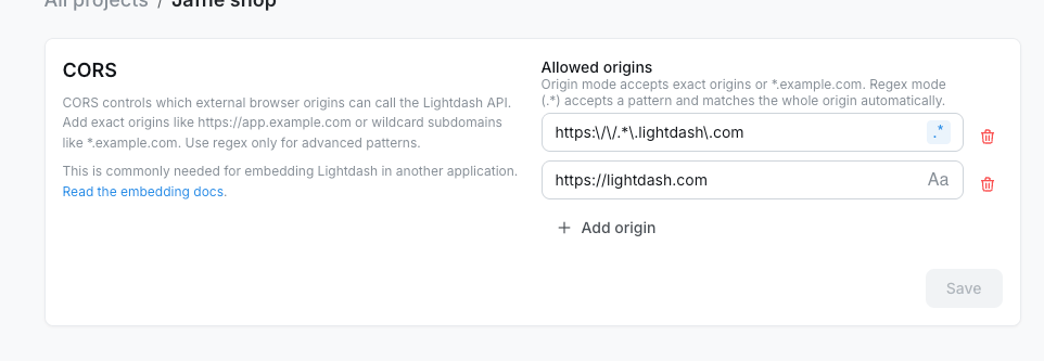
https://app.example.comallows only that exact origin.*.example.comallows HTTPS subdomains likehttps://app.example.comand is saved as a regex pattern.
.*) for advanced patterns. Enter the pattern body only; Lightdash matches the whole origin automatically. For example, https:\\/\\/.*\\.example\\.com allows subdomains of example.com.
For self-hosted deployments, you can also configure instance-level allowed origins with environment variables:
LIGHTDASH_CORS_ENABLED=false only if you want to disable CORS for the whole instance.
Browsers enforce a Same-Origin Policy that blocks a web application from making requests to a domain other than the one that served it. Because the React SDK calls the Lightdash API from your frontend, your instance has to name your application’s origin in its CORS configuration for those requests to go through.
Installing the Lightdash SDK
In your frontend project, use your preferred package manager to install the SDK.Starting with Lightdash
v2.207.0, the Embed SDK (@lightdash/sdk) requires React and React DOM 19.2 or later. Before installing or upgrading the SDK, update both react and react-dom in your frontend project to meet this requirement.This requirement does not apply to @lightdash/query-sdk, which is unaffected.For Next.js, version 15 or later is required.Import CSS styles
The Lightdash SDK requires CSS styles to render components correctly. Import the SDK’s CSS file as the first import in your React application’s entry point:Components and hooks
The Lightdash SDK exports components for embedding Lightdash content and hooks for building custom host-app UI around embedded content:Lightdash.Dashboard- Embed complete dashboards with multiple tilesLightdash.DashboardBuilder- Let embedded users create a brand-new dashboardLightdash.Chart- Embed individual saved chartsLightdash.Explore- Embed interactive data exploration interfaceLightdash.AiAgent- Embed an AI agent so users can chat with their dataLightdash.MetricsCatalog- Embed the project metrics catalog so users can browse and explore metricsLightdash.useLightdashContent- List spaces, dashboards, charts, and data apps for a custom content catalogLightdash.useLightdashAiAgentThreads- List an embed user’s previous AI agent threads to build a thread history UI
Lightdash.Dashboard
Embed complete Lightdash dashboards with multiple visualizations, filters, and interactive features. See Embedding dashboards for the JWT claims that control what viewers can do.Props
Basic usage
With filters
Apply filters programmatically using thefilters prop:
With styling
With explore callback
Track when users navigate to explore:With edit mode
When the JWT includes awriteActions claim, you can render an existing dashboard in edit mode and let users rename it, add saved charts from the allowed space, move or resize tiles, and save changes. The host app controls the edit-mode state through isEditMode and onEditModeChange.
writeActions.spaceUuid, so users can only pick saved charts from the allowed space. See Write actions for the JWT claim.
Lightdash.DashboardBuilder
Let embedded users build a brand-new dashboard from scratch. On mount, the SDK creates an empty dashboard in the JWTwriteActions.spaceUuid and renders it through the same embedded dashboard component as Lightdash.Dashboard. The host app controls when the dashboard is in edit mode.
Use this when you want your customers to author their own dashboards inside your app — for example, a “Create dashboard” page in your customer portal — without giving them a Lightdash login.
Props
Basic usage
Requirements and behavior
- The JWT must include a
writeActionsclaim withspaceUuid. JWTs withoutwriteActionsfail closed for write-capable paths. - The new dashboard is created in
writeActions.spaceUuid, named “Untitled dashboard”, and is empty. - Add-tile content (saved charts and SQL charts) is filtered to the same space.
- Dashboards created or edited through the SDK are normal Lightdash dashboards — they can be viewed and edited from Lightdash and vice versa.
- See Write actions for the JWT claim and how to configure the actor and destination space.
Lightdash.Chart
Embed individual saved charts for focused, single-metric displays with minimal UI.Props
Unlike Dashboard, Chart does not support
filters or onExplore props since charts are read-only and cannot navigate to explore.Basic usage
With styling
Token generation for charts
Charts require a JWT withtype: 'chart':
Lightdash.Explore
Embed interactive data exploration interface with full query builder capabilities.Props
Basic usage
With styling
Token generation for explores
Explores requirecanExplore: true in the JWT:
Lightdash.AiAgent
Embed a Lightdash AI agent so embedded users can chat with their data, generate charts, and save results back to a fixed space — without a Lightdash login. The component renders the agent inside an iframe. UsethreadUuid to deep-link into an existing thread, or omit it to land on the new-thread screen.
Props
Lightdash.AiAgent does not accept filters, contentOverrides, uiOverrides, or onExplore. Threads, navigation, and chart actions are managed inside the embedded agent UI. Changing token reloads the iframe; see Rotating tokens.onThreadChange fires whenever the embedded agent creates a new thread or opens an existing one. Use it together with threadUuid to persist the current conversation in your app (for example in localStorage or your own backend) and resume it the next time the user returns. Under the hood, the SDK passes a targetOrigin query parameter to the iframe and listens for lightdash:aiAgentThreadChanged postMessage events from the embedded page — no extra setup is required on your side.
Basic usage
Open a specific thread
PassthreadUuid to deep-link the embed into a specific conversation on mount:
Persist and resume the last conversation
CombinethreadUuid and onThreadChange to keep users on their most recent thread across page reloads. This example stores the latest thread UUID in localStorage:
Token generation for AI agents
AI agent embeds require a JWT withcontent.type: 'aiAgent' and a writeActions claim that pins the destination space and the actor used for agent queries and chart saves:
Lightdash.MetricsCatalog
Embed the Lightdash metrics catalog so embedded users can browse the metrics defined in a project, preview them, and — when the JWT allows it — continue into Explore without leaving your app. When a viewer clicks Explore from here on a metric, the SDK swaps in an embedded Explore view; a Back action returns them to the catalog.Props
Lightdash.MetricsCatalog does not accept filters, contentOverrides, uiOverrides, or onExplore. The catalog and the embedded Explore it launches are managed inside the component.Basic usage
Token generation for the metrics catalog
Metrics catalog embeds require a JWT withcontent.type: 'metricsCatalog' and a projectUuid. Set content.canExplore to true to let embedded users open Explore from a metric, and include a writeActions claim if you want them to save the resulting charts back to Lightdash.
canExplore (or set it to false) to publish a read-only browse experience. See Embedding the metrics catalog for the full guide and Metrics catalog token for the complete JWT structure.
API hooks
Lightdash.useLightdashContent
UseuseLightdashContent when you want your own app to list Lightdash content instead of embedding the Lightdash home page. A common pattern is to let customers choose a space in your UI, show the dashboards and charts in that space, then render the selected object with Lightdash.Dashboard or Lightdash.Chart.
The hook calls the Lightdash content API and returns metadata only. It does not render the selected chart or dashboard, and it does not replace the chart or dashboard embed token you pass to the render component.
Backend: generate an API access token
Generate the token on your backend with your Lightdash embed secret. Never expose the embed secret in browser code.Frontend: list content in a space
Options
Lightdash.useLightdashAiAgentThreads
UseuseLightdashAiAgentThreads when you want to show your users a list of their previous AI agent conversations — for example a “Recent chats” sidebar next to a Lightdash.AiAgent embed. The hook calls the AI agent threads endpoint with the embed JWT, so it returns only threads that belong to the JWT-authenticated embed user and are scoped to their embed space.
Pair it with Lightdash.AiAgent’s threadUuid and onThreadChange props to let users resume any past conversation.
Options
LightdashApiClientConfig as useLightdashContent, with auth.type: 'embedToken' and the AI agent embed JWT as the token.
Types
Example: thread history + resume
useLightdashAiAgentThreads uses the same embed JWT you pass to Lightdash.AiAgent. The token’s content.agentUuid and writeActions.spaceUuid are what scope the returned threads — the hook cannot list threads from a different agent or space, even if you pass a different agentUuid argument.Generating embed tokens
All SDK components require JWTs generated server-side, signed with the embed secret from embed setup. Here’s a complete example, including user attributes for row-level filtering:Backend API endpoint
Frontend React component
Rotating tokens
Self-hosted instances need Lightdash
2.137.0 or later to replace a token at runtime. On earlier versions the component keeps sending the first token it was given.token prop can change at any time: the component stays mounted, dashboard filters, Explore state and chart edit mode are kept, and every request from then on carries the new token. Do not change the component’s React key to swap tokens; that remounts it and resets its state.
Lightdash.Dashboard, Lightdash.DashboardBuilder, Lightdash.Chart, Lightdash.Explore, and Lightdash.MetricsCatalog.
- Refresh before expiry. A request that already failed on an expired token is not retried with the new one.
- The new token replaces the old one for every SDK component on the page. Render one SDK component per page; two components with different tokens are not supported.
Lightdash.AiAgentrenders an iframe and passes the token in its URL, so changing the token reloads the agent and closes the open thread. Mint AI agent tokens that outlive the session instead.
Applying styles
Override styles within Lightdash components to match your application’s design.Supported style overrides
styles object passed to any component.
Font family
Sets the font family for all text within the embedded content. Font sizes and other properties are preserved.Some charts and components set
font-family explicitly, so the fontFamily style is applied with higher specificity to override these.Background color
Sets the background for the embedded content. Can be any color value or'transparent'.
Complete example
CSS class overrides
Beyond thestyles prop, you can target embedded dashboard elements directly from your application’s stylesheet. Each element below carries a stable, human-readable classname that is part of the SDK’s public API — it won’t change when internal layout does, so your overrides stay resilient across releases.
The filter, date-zoom, and parameter dropdowns render in a portal at the page root — outside the dashboard container — so target them with a global selector rather than as a descendant of the embedded dashboard.
Light and dark mode
Use thetheme prop to render embedded content in either 'light' or 'dark' mode. This is typically driven by the host application’s own theme state, so the embedded dashboard, chart, or explore matches the surrounding UI.
theme prop is supported on Lightdash.Dashboard, Lightdash.Chart, and Lightdash.Explore.
When
theme is set, the SDK forces the Mantine color scheme and ignores any user-toggled preference stored in the embed. Omit the prop to let the embed use its default (light) color scheme.Syncing with your app’s theme
Pass your app’s current theme value directly to the SDK so the embed re-renders when it changes:Combining with styles.backgroundColor
When theme is set, the embed uses the matching Mantine body background by default. If you also pass styles.backgroundColor, your value takes precedence:
Color palettes
You can customize the appearance of embedded dashboards using color palettes. Define multiple color palettes in your organization settings, then apply them to embedded dashboards using thepaletteUuid prop.
For more on customizing appearance, see customizing the appearance of your project.
Setting up color palettes
- Go to Organization settings > Appearance in Lightdash
- Define one or more color palettes
- Copy the palette UUID for the palette you want to use (or fetch from API
GET /api/v1/org/color-palettes)
Applying a palette
Pass thepaletteUuid prop to the Lightdash.Dashboard component:
Filtering data
Filters can be passed to<Lightdash.Dashboard/> to filter dimensions by values. Filters are applied as AND operations, each further restricting results. The Chart and Explore components do not support the filters prop.
Filter structure
Basic example
Multiple filters
Filters are applied as AND operations:FilterOperator enum
ImportFilterOperator from the SDK:
Available fields
Only fields that are available for filtering can be filtered. These are specified in the JWT passed to the SDK.To generate tokens with filterable fields, configure your embed in the Lightdash UI or include the appropriate fields in your JWT structure.
Localization
The React SDK has two translation props, split by what they translate:
There is no locale setting and no bundled language packs. Your app owns locale state and passes the translated strings for the language it wants. Anything you don’t override renders in the built-in English.
Both props are accepted by
Lightdash.Dashboard, Lightdash.DashboardBuilder, Lightdash.Chart, and Lightdash.Explore. They are React SDK props only; iframe embeds are not translatable.
Translating your content with contentOverrides
contentOverrides translates the content you author in Lightdash: dashboard names and descriptions, tile titles, chart names, axis labels, series names, markdown content, and the custom labels you’ve set on dashboard filters.
Recommended tools:
- Translation maps – The Lightdash CLI can generate translation maps when downloading content as code
- Runtime translation management – Use a translation library like
i18next - Translation production tools – Tools like Locize help manage translations efficiently
Video overview
Translation maps
The Lightdash CLI can produce translation maps for dashboards and charts. To include translation maps when downloading content, add the--language-map flag:
<file name>.language.map.yml file containing translatable strings.
Example translation map:
filters.labels block mapping each source label to its translation. Replace the right-hand values with the translated strings. Entries are keyed by the source label rather than by position, so translations keep working when filters are reordered, added, or removed. Renaming a filter label in Lightdash invalidates its entry, and the filter pill falls back to the untranslated label until you regenerate the map. Filters without a custom label show the field name, which isn’t translatable.
Translations only change what viewers see. When someone saves an embedded dashboard in edit mode, Lightdash keeps the source filter labels, so the saved dashboard is unchanged for other languages.
Runtime translation
At runtime, pass a translation object to the SDK’scontentOverrides prop. We suggest using i18Next to load translations:
Setting up i18Next with Locize
Translating the Lightdash UI with uiOverrides
uiOverrides translates the interface Lightdash renders around your content: filter operators and inputs, the add/edit filter popover, the date zoom control, tile menus, and dashboard export buttons.
Pass a flat object mapping keys to translated strings. The key set is exported as the TypeScript type SdkUiOverrides from @lightdash/sdk, so editors autocomplete every key and unknown keys are compile errors.
Both the
@lightdash/sdk package and your Lightdash instance must be on a version that includes uiOverrides. If you self-host, upgrade your instance as well, since the strings render inside Lightdash’s UI. There is no feature flag; uiOverrides is available wherever embedding is available.Available keys
Keys are flat dot-paths, namespaced by the surface they translate:filters.*– operator labels (including date-specific variants), units of time, filter pills, the add/edit filter popover, value inputs, autocomplete states, the collapsed filter-bar summary, cross-filtering menu items, and the required-filters flow viewers seedateZoom.*– the date zoom control, granularity names, tooltips, and the per-tile zoom indicatortileMenu.*– the tile menu: Explore from here, Download data, Export image, View underlying datadashboard.*– dashboard-level export and print buttons
SdkUiOverrides type in @lightdash/sdk, so your editor autocompletes the full set. The complete list with the built-in English defaults:
All translatable keys with English defaults
All translatable keys with English defaults
Complete Spanish example
Complete Spanish example
A quick way to create a new translation: copy one of the examples above and ask an AI agent to translate the values into your target language. Keep the keys and any
{token} placeholders unchanged, then review the output before shipping it.Key rules
- Every key is optional. Partial dictionaries are fine; missing keys render in English.
- Keys are a stable, additive contract. Existing keys are never renamed or removed across SDK versions. New UI may add keys, which fall back to English until you translate them.
- Keep
{token}placeholders. Some values contain placeholders that Lightdash fills at runtime, like'filters.autocomplete.addValue': 'Add "{value}"'or'filters.crossFilter.menuLabel': 'Filter dashboard on {field} to'. Keep the token, with its exact name in braces, somewhere in the translation. Its position is free. No other syntax is supported (not ICU MessageFormat). - Plurals are one key per form. Count-dependent strings exist as separate keys, like
filters.summary.filterSingular/filters.summary.filterPlural, and units of time with.singular/.plural/.completedSingular/.completedPluralvariants. There are no CLDR plural rules, so languages with more than two plural forms can only approximate.
Using uiOverrides with an i18n framework
Because the map is flat JSON, it drops directly into i18next-style resource files. Keep a uiOverrides object per locale and pass the active one:
key prop) is the simplest way to re-render every string.
What can be translated
Not translatable:
- Data from your warehouse – string values in charts, dimension values, and raw table data render as they exist in your database
- Field and table names – dimension and metric names shown in the field picker, and on filter pills without a custom label, come from your dbt schema
- Date picker internals – month and weekday names inside calendar popups render in English
- Data formatting – numbers, dates, and currencies render per chart config
- Editor-only UI – dashboard edit mode is not translated